
Wayfinding / Amsterdam
This is the way
Schiphol, JFK and now Frankfurt airports have all turned to one Dutch designer to create the perfect signage systems. Paul Mijksenaar tells Monocle about his crusade to take the art of wayfinding in a new direction.
aul Mijksenaar, one of the world’s leading navigational sign designers, is lost. He is at Amsterdam’s Schiphol airport and is pacing, unable to locate his vehicle in the car park. Mijksenaar started to overhaul the airport’s signs 18 years ago (the project is ongoing), replacing the muddled system with bold designs that are now considered iconic. He runs Mijksenaar, a wayfinding consultancy with offices in Amsterdam and New York. “I’m always getting lost. That’s why I’m in this business,” he says.
Wayfinding, a term coined by Boston architect Kevin Lynch in 1960, is rising up the agenda of urban planners as the demand for more efficient and better-run cities (and, of course, airports) increases. A design-conscious public is also critical of anywhere that has poor signage – you soon fall out of love with a city or store that leaves you feeling lost. Signs, as much as they are used for navigation, have also become a branding tool with their subtle concoctions of visual graphics, colour codes and pictograms.
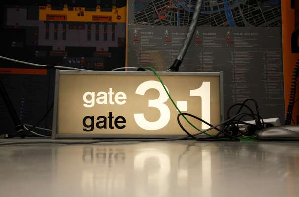
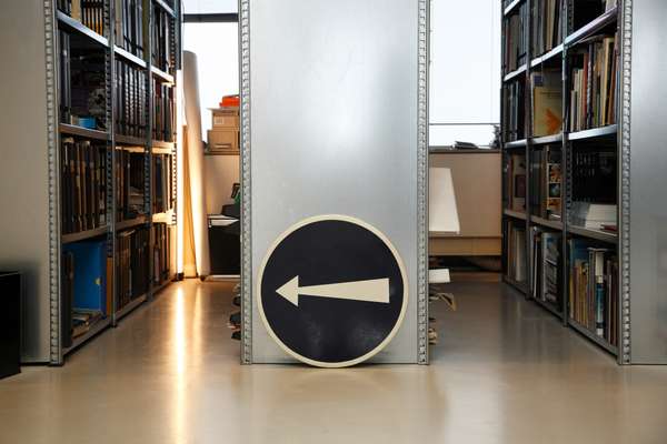
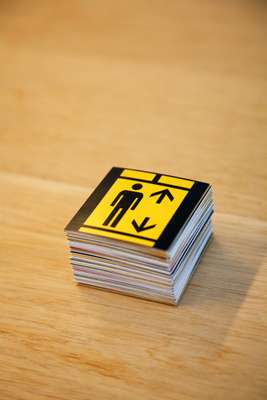
Outside Mijksenaar’s Amsterdam headquarters, a sign announces: “Mijksenaar, Waysigning people”. Inside, colourful signs are stacked haphazardly against the walls and a “Map of the Month” is pinned up. Mijksenaar is a hoarder – his archive of visual information memorabilia is neatly stored in bookcases and also rammed into drawers.
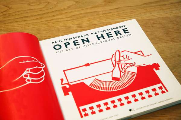
Since establishing his practice in 1986, Mijksenaar has worked on many high-profile projects, including the redesign of New York’s JFK, Newark and LaGuardia airports. The JFK signs were later replicated in Steven Spielberg’s movie The Terminal – a rare moment of glamour for this quiet, somewhat nerdy profession. Currently, Mijksenaar is writing two books, has ambitions to establish a wayfinding research institute, and is producing his first range of merchandise – from clothes to clocks – based on the graphics used on Schiphol airport’s signs. These will be sold at De Beyerd art gallery in Breda, which is relaunching in June as a graphic design museum.


Mijksenaar’s latest project is one of his biggest to date: an ambitious wayfinding scheme for Frankfurt airport, one of Europe’s busiest aviation hubs. It comes as the airport, operated by Fraport, undergoes an extensive €4bn expansion programme. This will see a fourth runway and a third terminal, designed by Frankfurt-based architects, Christoph Mäckler, added to the airport’s sprawl. Terminals 1 and 2 are also being extensively redeveloped.
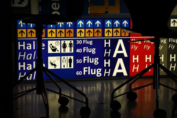
The aim of the new wayfinding is to create a more unified and intuitive system for the airport. To show the difficulties with the current signage, Mijksenaar and his team conducted what they call an “expert walk-through” as part of their research, filming in candid-camera detail how people interact with the signs. At Frankfurt airport there are currently two wayfinding schemes in operation, one for each terminal. These were designed in-house and sprung up as the airport expanded organically.
All too often signs are an afterthought, believes Mijksenaar. The new signs which focus on directing people to gates instead of terminals are more “streamlined”, according to Jens Grabeleu, a senior manager at Fraport. If the wayfinding is given the green light by Fraport later this year, the first raft of signs could be up by 2009.
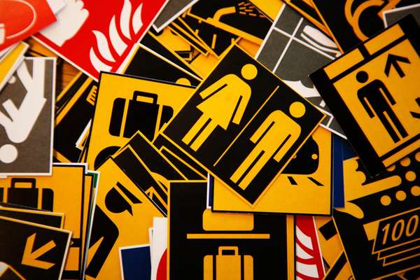
Flipping through presentation documents, Mijksenaar explains some of the key creative principles behind the new wayfinding, which is still in the design phase. The existing blue background has been retained for the sake of consistency, but the signs now feature rationalised colour coding. Departures signs are coded yellow, airport facilities white, and arrivals are light blue. The chosen font is The Sans, designed by Dutch graphic designer Lucas De Groot in 1994. Most intriguing are the pictograms, inspired by the work of the late German modernist and communist artist Gerd Arntz. These images look softer and friendlier than those that would typically be used at airports. So far around a dozen pictograms have been designed, but the portfolio is likely to swell to about 100.
Overall, the design is more rigorous and elegant and is in keeping with Mijksenaar’s ambition to create a universal wayfinding system for airports. All too often design commissions on this scale fall by the wayside, compromised by political and commercial interests. But provided Fraport has the far-sight to push this project through, it could soon be showing other airport operators the way.
Get lost: Mijksenaar’s pick of the worst wayfinding systems
Amsterdam: “In a new system for motorists based on numbered routes and postcodes, there are no directions to points of interest.”
Manhattan: “When you rent a car at JFK, you won’t find a sign ‘to Manhattan’. Signs only direct you to roads, streets, bridges and tunnels.”
Hong Kong: “I’ve never found a street map with public transport or public buildings. Signing is focused on helping motorists.”
Walk this way
London
We have recently been admiring a new wayfinding scheme called Legible London that has been springing up across the capital. It’s being tested in the run-up to the 2012 London Olympics. The signs feature maps, landmarks and walking distances and have been designed by London-based graphic consultancy Applied Information Group. An initial trial of 19 signs has been put up in the West End and, if local authorities approve, the signs will be rolled out across all 33 boroughs. Monocle hopes the city adopts this smart design on its streets.
South Korea
The South Korean government has appointed Rotterdam-based Studio Dumbar to redesign wayfinding for its entire road network. Studio Dumbar, which won the project last year, is in the final design stage of the project.
