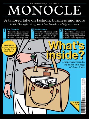
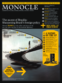
Fonts of knowledge - Issue 33 - Magazine | Monocle
/

thumbnail text

It’s a Friday morning and Yasuo Ebisu is hunched over his worktable, sketching in silence. On graph paper he traces the outlines of Japanese kanji characters, the picture-like words that originate from China. Ebisu is one of more than 10 designers at font-maker Morisawa’s factory in Akashi – a city 60km east of Osaka – who sketches by hand every new font that the company produces.

In an era when most designers – of cars to couches – conduct their work on computers, Morisawa’s font factory may seem an anomaly. But the company doesn’t think so. Many of Morisawa’s rivals design fonts only on computers, but starting a new typeface with handcrafted drawings has been the Morisawa way for more than 50 years. “We continue drawing fonts by hand because we think that’s the best way to maintain quality,” says Tsunehisa Morisawa, who heads the font-making operations.

Few people overseas have heard of Morisawa but in Japan the company is to fonts what Intel is to computer chips. Founded in 1948 as a phototypesetting machine maker, Morisawa is the biggest purveyor of fonts used by many of the country’s major book and magazine publishers. Its minimalist Gothic and fancy Mincho typefaces are the Japanese equivalents of Times Roman and Helvetica in the West. Its fonts are read countrywide, from train station signage on the Yamanote line in Tokyo to the menus of Sony’s PlayStation 3 video gaming consoles.

For such a giant in the world of fonts, Morisawa’s factory is modest. Tucked away on a residential street, next to a Buddhist temple, the four-storey building houses just 34 employees and blends in with the surrounding houses and flats. (Members of the Morisawa clan live in the eastern wing of the building.) Only a small metal plaque that reads “Morisawa Bunken Co” on one wall hints at what goes on inside. “One of our young designers often passed by the building when he was a student but had no idea what went on here,” says Tsunehisa Morisawa.

When the Morisawa clan, who retain their controlling stake in the firm, built a new headquarters in Osaka, they decided to keep the font-making factory separate from the sales, marketing and software departments as they wanted to let designers single-mindedly pursue their craft. “The only thing they do here is font design,” says Tsunehisa Morisawa. “They can focus and not have to think about sales or marketing.” Morisawa’s revenues (up 5.3 per cent last year to €90m) mainly come from book publishers who license its fonts.

Morisawa has about 200 complete font sets in its library. And as publishers look to target laptops, smartphones and tablet computers, so does ­Morisawa. “My grandfather’s and father’s generations only knew the paper printing business,” says Akihiko Morisawa, 46, a year older than brother Tsunehisa and who took over as president last year. “Our generation is working in new media. We need to adapt.”

Developing a font takes years and can cost as much as €820,000. Why so long? Japan’s complex writing system relies on three different alphabets – kanji characters plus two 48-character phonetic alphabets called hiragana and katakana. Numbers, symbols and the Roman alphabet are usually standard in a Japanese font set. So while Roman alphabet fonts might run to ­several hundred characters, the basic Japanese font set has 7,000, and a complete set more than 23,000 characters.

At the factory in Akashi, every new design starts with brainstorming sessions, spread out over a year. The designers try to spot trends from magazines, books and ads, says Nobuyuki Miura, the font factory’s second-in-command. He opens an album to a photo from one recent meeting. Post-it notes in five colours are arranged into categories on a whiteboard. The notes are then whittled down to a set of rules: how many characters, what style – conservative or playful, or a mix – and whether the font is for books, ads or signs.

The drawing phase starts with the chief designer, who sketches the first 400 to 500 characters alone to ensure consistency. Decades ago, the designers wrote in charcoal and edited characters with white paint. Now Ebisu, the designer, uses a 2H mechanical pencil and eraser. Inside a 6cm x 6cm grid, he draws basic lines for the kanji character meaning “eternity”, and uses straight- and curved-edge rulers to complete the character’s outline.

Ebisu’s initial set of characters acts as a guide for other designers who later step in to help. New hires usually have to practise their technique for five years before being allowed to draw. “The clues for thousands of characters are contained in the core set,” says Tsunehisa Morisawa. “If the first 500 are bad or inconsistent, or changes need to be made, the designer will start from scratch. Fortunately, that rarely happens these days.”

It’s intense work, and the only sound in the room is a faint, high-pitched whine from the computers and printers. Management worries that the designers would work all day like this. So every two hours a chime reminds the entire group to take a break. The ultimate goal is quality, whatever the cost. Deadlines exist, but are easily forgotten if the designers need more time to perfect each character. In 1986, designers started work on the Shin Go font, a simplified version of the company’s classic Gothic sans-serif font. It took more than four years to finish – that’s two years longer than expected.

A few metres away from the designers, eight technicians seated at computers use the scanned sketch to make a digital likeness in an illustrator program. For the digital version, the process of checking every character for flaws is brutal. The designers are looking out for almost imperceptible irregularities, on guard for bits that stick out too much, are too fat or at the wrong angle.

Technology has not affected the firm’s perfectionism, nor its reliance on the designer’s eye over computer wizardry. Hence the timeframes. The new font’s name? “We haven’t decided yet,” says Morisawa, closely scanning the characters. “This font is still a couple of years away from completion.”

Timeline

1948: Founded as a phototypesetting machine maker in Osaka
1955: Releases first font designed in-house, Chu Gothic BB1, for phototypesetters
1986: Works with US software firm Adobe on digital Japanese font format
1989: Apple unveils Laser Writer NTX-J, first printer with Japanese fonts in Adobe format. Fonts are made by Morisawa
1991: Releases Shin Go font after more than four years in development. It goes on to become a signature font
1994: Quits phototypesetter production
1999: Exits glass plate production for phototypesetters; designers focus on digital fonts
2005: Changes font business model; leases package of fonts instead of selling individual fonts
2009: Rebuilds headquarters in Osaka

What’s your type? 

Ryumin (1985)
A versatile Mincho family font that’s suitable for ads, magazines and hardcover books. Recreates the sharpness found in the classic metal type, and has soft, rounded edges.

Shin Go (1991)
A Gothic family font that’s modern, conveys levity, and is an extension of Helvetica and Univers fonts. Commonly used in public signage, mobile phones and video game display menus.

Chu Gothic BBB (1964)
Orthodox font for texts. Easy to read even at small sizes. Commonly used in books and captions.

Gothic MB101 (1974)
Reliable and sturdy. Thick characters are commonly used for titles and thin characters for magazines.

Folk (1970)
Design falls between Gothic and Mincho fonts. Mixes thick and thin lines similar to Mincho font. Eye-catching and easy to read. Used in logos and movie titles.

Share on:

X

Facebook

LinkedIn

LINE

Email

Go back: Contents
Next:

Edits

/

sign in to monocle

new to monocle?

Subscriptions start from £120.

Subscribe now

Loading...

/

15

15

Live
Monocle Radio

00:0001:00

  • The Continental Shift