UP Express / Toronto
The missing link
Set to revolutionise Toronto’s transport network, new air- rail connection UP Express is made to be business-traveller friendly. And with an aesthetic influenced by the Canadian landscape and some sharp uniforms, it looks the part, too.
Stood on a station platform, MONOCLE isn’t waiting for a specific train but rather anticipating a bright future filled with them. Work crews are busy applying final touches and behind these last-minute tweaks sits the flagship terminal of UP Express. It’s the pioneering new air-rail link connecting Union Station in Toronto’s downtown – including its network of rail, subway and bus lines – with Toronto Pearson International Airport.
Timed to open in advance of the city’s hosting of the Pan Am/Parapan Am Games this summer, UP Express trains will deliver travellers between Canada’s two busiest transport hubs in just 25 minutes. It is one of the largest-scale projects of its kind in North America and has been done with considerable élan. “The feel is very Canadian,” says architect Tarek El-Khatib as he surveys the scene. “There’s something about the noble materials, natural woods and metals, and colouration that work with our seasons.”
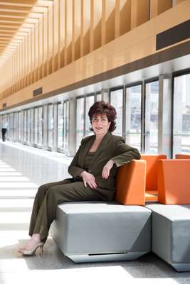
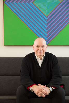
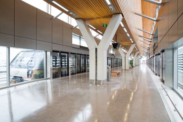
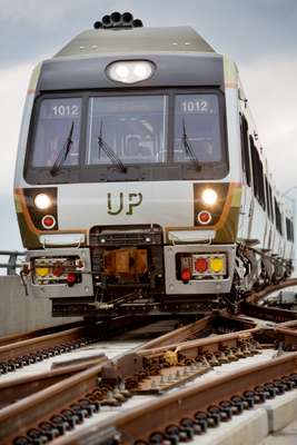
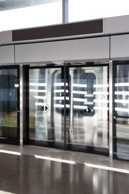
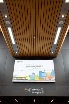
“A lot of thought has gone into the station’s contextual fit,” says El-Khatib, referring to the Toronto firm that led the station’s design: Zeidler Partnership Architects. Its composition marries elements of the natural landscape with the modern metropolis. Cast-concrete Y-columns can be seen rising out of the terrazzo flooring to support the undulating wooden ceiling; natural light filters down between the beams as if through a forest canopy. Toronto’s skyline is visible across the tracks. “This is one of the few stations that involve branding to such an extent. We hope it will be an exciting way of reaching Toronto,” says El-Khatib.
Given the protracted squabbles at City Hall that have delayed the creation of new, much-needed rapid transit, locals might have been taken aback that the C$456m (€346m) UP Express project happened at all. Equally surprising is that transit authorities decided to show such design ambition, recognising the opportunity to create a new gateway experience. “The vision was to change the way that people travel from downtown to the airport and to transform the way that people see [Toronto],” says UP Express president Kathy Haley. “We wanted to create the most seamless, serene and enhanced urban-transportation experience on the continent and compete on the global stage.”
To help do that, Haley hired London agency Winkreative (MONOCLE's sister company) to develop a creative identity. Its name, self-explanatory as it might be (from Union to Pearson: U to P), directed the early discussions, referencing the overall experience of being elevated, the visual cue of the hill climbed prior to arriving at Pearson and the flight one takes at the beginning or end of the rails.
The team looked to Ontario’s natural scenery of rolling forest and Canadian Shield for inspiration, deciding on an earthy palette of sage green, cool grey and pumpkin orange. “We thought about how to visualise the journey,” says Maurus Fraser, Winkreative’s creative director. “We wanted to capture the seasons, the forests and lakes, and remind people of that experience before they travel.”
From there it was a matter of articulating a consistent creative identity, underscored with references to the golden age of rail and air travel. “We wanted every element to reflect that design system,” says Haley, “from the trains’ livery and the carriages’ interiors to the typography on signage and the stations’ architecture.” The sense of a brand aesthetic and story comes to life most charmingly in the staff uniforms: part mid-century conductor, part woodsman chic.
The project has been benchmarked against the best examples of air-rail link services elsewhere, including those in Hong Kong, Oslo, Stockholm and London. What’s unique here, especially in the North American context where express air-rail links are something of a novelty, is the design-led approach to creating a passenger experience: one that might enhance the impression Toronto makes on visitors while giving residents something to look forward to the next time they travel.
Station architecture
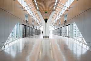
Of the four stations constructed, the showstopper promises to be the flagship terminal at Union Station. Toronto architecture firm Zeidler Partnership fulfilled its design brief with the use of materials and colours that evoke Ontario’s landscapes, from the ribbed-oak ceiling beams that allow for bursts of ambient light to the exterior’s zinc cladding that will oxidise over time. The use of cast concrete for the Y-columns might be read as an homage to a local legacy of brutalist architecture. “The design is minimal but the feeling is robust and warm,” says Zeidler partner Tarek El-Khatib.
Though other firms were hired to design the end terminal at Pearson (Adamson Associates) and stops at Bloor and Weston (MMM Group), with Zürich-based Hosoya Schaefer consulting, key themes occur throughout the station architecture. There is the repetition of the Y-columns, wood, terrazzo flooring and the use of exposed concrete. “Even though they may manifest themselves in different architectural forms there will be a correlation between them all,” says El-Khatib. “That’s the strength of the original branding.”

Trains and livery
For its rolling stock, UP hired Nippon Sharyo to manufacture 18 Tier 4 Diesel Multiple Units, marking the first time the Nagoya-based firm’s state-of-the-art carriages will run on North American rails. “Nippon Sharyo is renowned for on-time delivery,” says Kathy Haley, highlighting a critical factor in trying to make UP’s deadline in advance of July’s Pan Am Games. “And they have deep experience working within our kind of design system.”
The livery, inside and out, is true to UP’s visual language. Painted in the brand’s autumnal hues with a bright metallic streak showing across the middle, the trains cut an iconic dash across the urban landscape. “The design itself almost slims the train a little bit,” says Maurus Fraser of Winkreative.
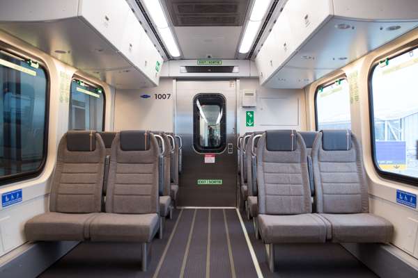
Spaciously seating 60 and equipped with free wi-fi, the carriages’ interiors display the same attention to detail. From the choice of fabrics and textures to the service’s own in train magazine, it reflects what Haley calls the core value of UP’s “value proposition” — to surprise and delight its guests.
Uniforms
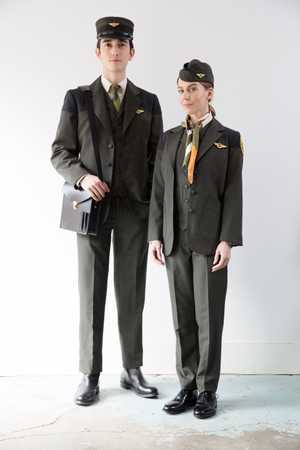
Toronto clothier Matt Robinson of Klaxon Howl – known locally for its military and workwear-inspired designs and vintage collector pieces – was tasked with creating a modular, multi-seasonal uniform that references the golden age of air and rail travel while articulating UP’s visual language in human form. “They wanted something that was approachable and not too military-looking but that still commanded some sort of presence,” says Robinson.
Drawing on UP’s colour palette, Robinson has clothed the train’s guest- service providers in fitted, forest-green blazers and waistcoats with gabardine shoulder yokes and accompanied by trousers and pencil skirts that cut a sleek silhouette. A stitched shoulder crest tells the brand story – featuring the clock in old Union Station’s Great Hall, a trillium (the provincial flower), a pine and rail tracks – but uses non-industrial threading with colours that will mellow with age.
Robinson is pleased that people are already asking about buying items from the ensembles, such as the tartan-patterned scarf and women’s wedge hat. “We wanted pieces that were going to be coveted by the viewer,” he says.


